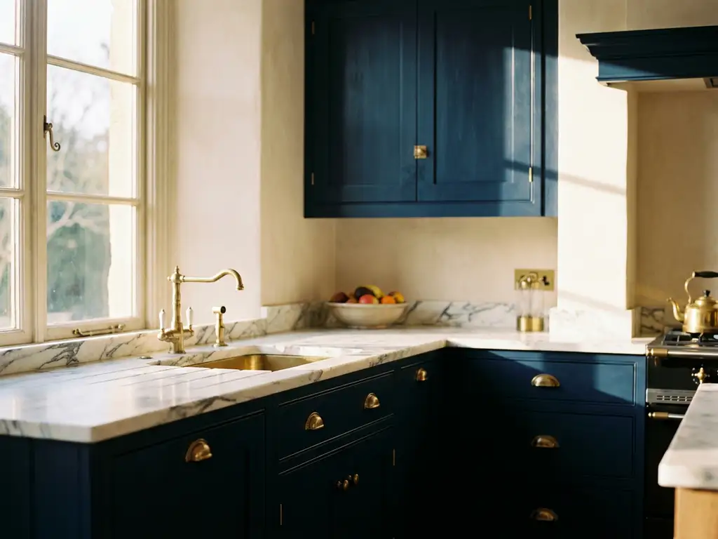
Farben, die eine Küche edel und teuer wirken lassen, sind vor allem gebrochenes Weiß, Tiefgrau, Salbeigrün, Dunkelblau und warme Erdtöne wie Taupe oder Greige. Diese Töne wirken ruhig, durchdacht und harmonisch, weil sie wenig visuelle Unruhe erzeugen und gut mit natürlichen Materialien wie Holz, Stein oder Messing kombinierbar sind. Welche Farbpalette am besten passt, hängt von Lichteinfall, Raumgröße und dem gewünschten Stil ab. Die folgenden Abschnitte zeigen, worauf es bei der Küchengestaltung mit Farbe wirklich ankommt.
Which color palettes look particularly high-quality in the kitchen?
In the kitchen, muted, saturated colors with low saturation look particularly high-quality. These include anthracite, dark green, deep black, cream, and warm gray tones. These colors convey depth and tranquility without being intrusive. They can be combined with high-quality materials and radiate a natural elegance that bright accent colors rarely achieve.
Bright, clear colors like pure white, however, can quickly appear sterile or cheap when used without contrast. Broken white, that is, tones with a slight hint of yellow or a grey component, creates a warmer and more homely atmosphere. Those who want to design a modern, elegant kitchen opt for color palettes from the so-called greige range, that is, a blend of grey and beige, or for classic dark blue in the tradition of English country kitchens.
In kitchen design, moss green, olive green and warm chocolate brown have also been experiencing a strong renaissance in recent years. These colors feel grounded, timeless, and go well with brass finishes, natural stone, and dark wood.
How does the brightness of a color affect the sparkle effect?
The brightness of a color affects how it reflects light and, therefore, how high-quality it appears. Matte surfaces absorb light and therefore appear deeper, quieter, and often more noble. High-gloss surfaces reflect light strongly, which makes rooms appear larger, but also makes fingerprints and unevenness more visible.
In practice, the rule applies: matte or semi-gloss fronts in dark colors look particularly luxurious because they create depth without dazzling. High-gloss works best in pure colors such as white or black and in well-lit rooms. A combination of matte surfaces on the fronts and glossy elements such as worktops or back walls creates interesting contrasts and looks sophisticated.
The same applies to walls: a matte wall paint in a dark tone like anthracite or dark green looks significantly more high-quality than the same color in high gloss, which can quickly look like plastic.
Which color combinations make a kitchen look more expensive?
Color combinations that make a kitchen look more expensive are based on contrast and restraint. Combinations like dark blue with brass, anthracite with natural wood, white with black steel, or sage green with cream have proven themselves to be successful. These pairings work harmoniously because they create contrasts without being overbearing.
An important rule: Less is more. Kitchens that appear expensive usually consist of two to three colors. One main color for the fronts, a neutral color for the walls and ceiling, and an accent color for the fittings, fixtures, or backsplash. Mixing too many colors creates visual chaos that detracts from the overall impression.
The combination of light upper cabinets and dark lower cabinets is particularly effective, also known as a two-tone kitchen. This design looks modern and sophisticated and is widely used in high-end kitchen designs.
What role do walls and back walls play in the color effect?
In the kitchen, the walls and back walls are the areas that most strongly shape the overall impression of a color. The back wall behind the stove or the worktop is the visual center of the kitchen and therefore has a disproportionately large influence on the effect of the room.
A backsplash in an accent color, such as deep petrol, warm terracotta, or classic black, can instantly elevate a neutral kitchen. At the same time, the backsplash protects against splashes and grease, which is why the choice of material is particularly important here. Tiles, glass, natural stone, or high-quality printed foils are common options.
Wall colors should be matched to the kitchen color, but not identical. A slightly different tone in the same color family creates depth without dividing the space. Those with a dark kitchen benefit from lighter walls that optically open up the space.
Should you choose warm or cool colors in the kitchen?
Whether warm or cool colors work better depends primarily on the amount of light and the size of the room. Warm colors like beige, taupe, olive green, or terracotta are inviting and comfortable, especially in kitchens with little natural light. Cool colors like gray, blue, or gray-green appear brighter and more modern, but are especially suitable for light, well-lit rooms.
In kitchens with north-facing windows that receive little direct sunlight, cool grey tones can quickly appear cold and uncomfortable. Here, warm grey tones with a slight beige or green component are a better choice. In kitchens with plenty of light, however, cool colours like dark blue or slate grey can fully unfold their full potential.
In general, warm colors make a kitchen more cozy, while cool colors often appear more modern and clear. Both can have an elegant effect when they match the light and the materials.
How can you enhance the color of a kitchen without renovation?
A kitchen can be given a facelift without renovation by changing the colors of specific surfaces without interfering with the structural elements of the building. This includes applying self-adhesive film to the fronts, replacing the handles and knobs, and decorating the back wall with printed or colored film.
Self-adhesive films are particularly interesting for tenants because they can be removed without leaving any residue and do not cause permanent changes. With a high-quality PVC-free self-adhesive film With a new color or pattern, kitchen fronts, back panels, or even worktops can be completely transformed visually without the need to hire a craftsman.
Even small changes have a big impact: new brass or matte black handles, a new pendant light above the work surface, or a colorful carpet in front of the kitchen area can significantly improve the overall impression. Those who want more impact combine several of these measures and work with a clear color concept.
Kitchen backsplashes by com2C: color and quality for your kitchen
If you want to update your kitchen’s color scheme without renovating, the backsplash is the most effective approach. We develop and produce high-quality printing media that serve as a base for custom-made, individually printed kitchen backsplashes for print service providers and advertising agencies. The result are surfaces that are visually appealing, durable, and easy to remove without leaving residue.
- Customized color design: Any motif, any color and any format is possible
- Leave no trace removal: Ideal for rental properties without structural interventions
- Precise color reproduction: Our materials are optimized for solvent, latex, and UV printing systems
- Sustainable materials: Our GoGreener line offers PVC-free alternatives without compromising on quality
- Customized solutions: Perfectly tailored to any kitchen size and wall area
Our Kitchen backsplashes are used by specialist companies throughout Germany and offer a reliable, visually high-quality solution for anyone who wants to redesign their kitchen without a great deal of effort. If you have any questions about the materials, formats or implementation, we look forward to hearing from you. Consultation.